

A logo is more than just an image that represents a brand: it’s the visual cornerstone of a company’s identity. When executed correctly, a logo rebrand can breathe new life into a company, signaling evolution and progress. However, when done poorly, it can alienate loyal customers and damage brand equity that took years to build. In today’s fast-paced market, where consumer attention is increasingly fragmented, the stakes for logo redesigns have never been higher.
The Psychology Behind Logo Rebrands
Logo rebrands are deeply psychological endeavors. They tap into our human tendency to form attachments to familiar symbols while also responding to our desire for novelty and freshness. Companies must balance these competing forces when considering a logo redesign.
When consumers see a logo repeatedly, they develop what psychologists call “mere exposure effect” – a preference for things simply because they are familiar. This explains why dramatic logo changes often face initial backlash: they disrupt the comfort of the familiar.
At the same time, our brains are wired to notice change. A thoughtful logo update can reinvigorate consumer attention and signal important shifts in a company’s direction or values. The key is finding the sweet spot between recognition and reinvention.
Why Companies Rebrand Their Logos
Companies undertake logo redesigns for various strategic reasons:
• To modernize an outdated visual identity
• To reflect a change in company direction or expanded offerings
• To distance from negative associations or past controversies
• To stand out in an increasingly crowded marketplace
• To appeal to new demographic targets
• To unify brand elements after mergers or acquisitions
• To simplify complex designs for better digital compatibility
Understanding the primary motivation behind a rebrand is crucial for evaluating its success. A logo update intended to signal corporate transformation should be judged differently than one aimed at improving digital functionality.
“Logos are a graphic extension of the internal realities of a company.”
— Saul Bass, graphic design pioneer
What Works: Successful Logo Rebrand Strategies
The most successful logo rebrands share certain characteristics that help them connect with audiences while achieving business objectives. Learning from these triumphs offers valuable insights for any brand considering a visual refresh.
Evolutionary Rather Than Revolutionary Changes
Gradual evolution often works better than complete reinvention. Brands that maintain core visual elements while refreshing their logos tend to preserve brand equity while still signaling progress.
Take Google’s logo evolution as an example. Since 1998, Google has updated its logo multiple times, but each iteration maintained the recognizable multicolored wordmark. The 2015 redesign switched from a serif to a sans-serif typeface, creating a more modern look while keeping the playful color sequence intact. This evolution preserved brand recognition while improving scalability across digital platforms.
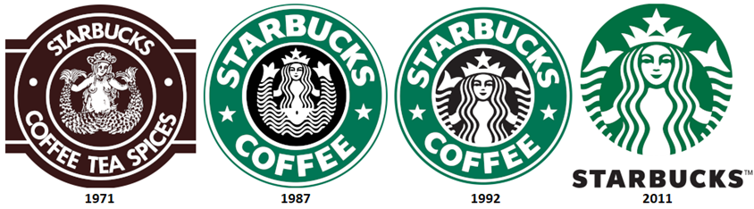
Similarly, Starbucks has slowly simplified its mermaid emblem over decades, removing the outer ring and details while maintaining the iconic siren figure. Each iteration became progressively cleaner while remaining instantly recognizable.
Simplification That Enhances Functionality
Many successful rebrands involve simplifying complex logos for better functionality across platforms. This trend toward minimalism serves both aesthetic and practical purposes:
Benefits of simplification:
• Improved scalability for small digital spaces (app icons, favicons)
• Better legibility at a glance
• Faster recognition in crowded visual environments
• Easier animation for digital applications
• More versatile application across different media
• Reduced production costs for physical implementations
Mastercard’s 2016 rebrand exemplifies this approach. By removing the comb pattern and text overlay from its intersecting circles, Mastercard created a cleaner symbol that works better at small sizes while maintaining instant recognition. The simplified logo performs beautifully across digital platforms while honoring the brand’s 50-year visual heritage.
Thoughtful Implementation and Rollout
Even the best-designed logos can fail without proper implementation. Successful rebrands typically feature:
• Clear communication about the reasons behind the change
• Gradual rollout that prevents consumer shock
• Comprehensive guidelines ensuring consistent application
• Cross-platform optimization for different environments
• Engagement with stakeholders throughout the process
When Airbnb introduced its controversial “Bélo” symbol in 2014, the company supported it with extensive storytelling about the meaning behind the new mark. They created videos explaining how the symbol represented “belonging” and gradually integrated it alongside their wordmark. Despite initial mixed reactions, this thorough rollout strategy helped the symbol eventually gain acceptance.
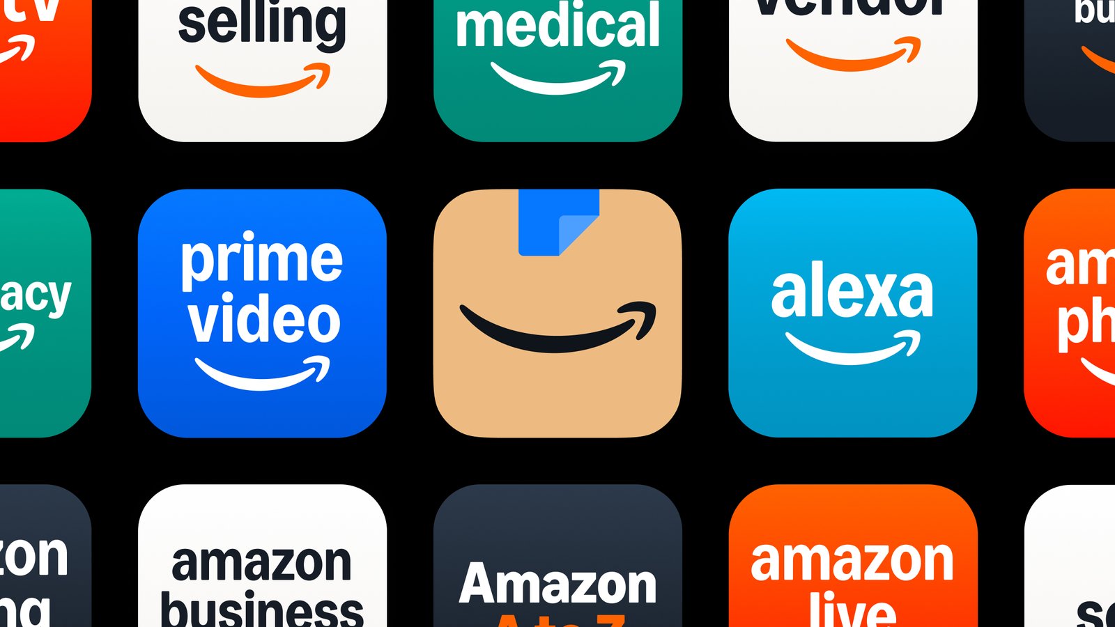
![]()
“Design is thinking made visual.”
— Saul Bass
What Doesn’t Work: Logo Rebrand Failures
For every successful logo redesign, there are cautionary tales of rebrands that missed the mark. These failures offer valuable lessons about what to avoid.
Ignoring Brand Equity and Emotional Connections
One of the most common rebrand mistakes is underestimating the emotional attachment consumers have to familiar logos. When Gap unveiled a new logo in 2010, replacing its classic blue square with a modern wordmark and small gradient square, consumer backlash was immediate and fierce. Within a week, the company reverted to its original design.
The Gap incident demonstrates how logos can transcend mere identification to become cultural touchpoints that consumers feel ownership over. Successful rebrands acknowledge this emotional connection rather than dismissing it.
Following Trends Rather Than Strategic Objectives
Another pitfall is chasing design trends without clear strategic purpose. When logos follow passing fads rather than aligning with a company’s core values and positioning, they often feel inauthentic and quickly become dated.
Common trend-chasing mistakes:
• Adopting minimalism without considering brand personality
• Following competitor designs rather than differentiating
• Implementing gradients or effects that quickly become dated
• Prioritizing trendiness over clarity and recognition
• Losing distinctive brand elements in pursuit of conformity
Tropicana’s disastrous 2009 packaging redesign (which included a logo change) followed contemporary design trends but abandoned the distinctive orange-with-straw imagery that consumers used to identify the product on shelves. Sales dropped 20% in two months, forcing a return to the original design.
Poor Execution and Communication
Even conceptually sound rebrands can fail through poor execution or communication. When the London 2012 Olympics unveiled its angular, fragmented logo, the design was widely criticized not just for its polarizing aesthetic but for its poor legibility and implementation.
The controversy was compounded by the organizing committee’s failure to effectively communicate the design’s rationale. While the logo’s disruptive nature was intentional—meant to appeal to younger audiences and signal a break from tradition—this purpose wasn’t clearly conveyed, leaving the public puzzled rather than intrigued.
“A logo doesn’t sell, it identifies. A logo derives its meaning from the quality of the thing it symbolizes, not the other way around.”
— Paul Rand, legendary graphic designer
Best Practices for Successful Logo Rebrands
Drawing from both successes and failures, several best practices emerge for companies considering logo redesigns:
Research-Based Approach
Successful rebrands start with thorough research rather than subjective preferences. This includes:
• Competitive analysis to ensure differentiation
• Consumer perception studies to understand current logo equity
• Performance testing across platforms and applications
• Cultural sensitivity reviews to prevent unintended associations
• A/B testing of potential designs with target audiences
When Pepsi redesigned its logo in 2008, the company conducted extensive consumer research and found that a more dynamic, asymmetrical smile conveyed optimism that resonated with younger consumers. While design critics debated the result, the research-backed approach ensured the new logo connected with its intended audience.
Finding the Balance Between Heritage and Progress
The most successful logo redesigns honor a brand’s heritage while still moving forward. This balance is particularly important for established brands with strong consumer loyalty.
When Volkswagen refreshed its logo in 2019, the company returned to a flatter, simpler version of its iconic VW monogram. This move simultaneously embraced the brand’s heritage while optimizing for digital applications. The thinner lines and simplified form maintained the core visual equity while creating a more contemporary impression.
 Cross-Platform Optimization
In today’s multi-channel world, logos must perform across an unprecedented range of contexts—from tiny app icons to massive billboards. Successful rebrands consider all these applications from the start.
Key optimization considerations:
• Legibility at various sizes and distances
• Performance on light and dark backgrounds
• Recognition in animated/moving contexts
• Adaptability for different aspect ratios
• Effectiveness in both color and monochrome applications
• Distinctiveness when seen alongside competitor logos
Nike’s iconic swoosh exemplifies cross-platform versatility. Its simple form is instantly recognizable whether it appears on a shoe, a digital banner, or a stadium sign. Its continued effectiveness has allowed the company to use it with minimal changes since 1971.
The best logo rebrands aren’t just aesthetic exercises—they’re strategic business decisions that balance heritage with progress, recognition with renewal, and distinctiveness with functionality. By learning from both successful and failed rebrands, companies can approach visual identity updates with the thoughtfulness they deserve, creating logos that not only look good but serve their fundamental purpose: embodying and advancing the brand they represent.
ABOUT TRIPSIXDESIGN
Tripsix Design is a creative agency based in Fort Collins, Colorado and Manchester, England. We specialize in branding, digital design, and product strategy – combining creativity with data-driven insight to deliver tailored, high-impact solutions. Small by design, agile by nature, we’re dedicated to producing thoughtful, high-quality work that drives results.
If you like what you’ve read here and would like to know more, or want to know how we can support your business growth, then connect with us here.
SOURCES
Forbes: What Volkswagen’s New Logo Can Teach You About Rebranding
Harvard Business Review: What Logos Do Companies Use When They Want to Seem Fresh and New
99designs: Famous Logo Redesigns: The Good, the Bad, and the Ugly

